Cereal Box Media (website design/branding)
Note: This website is awaiting a go-live date pending completion of development on the backend, which is done by another developer.
The code for this site can be found here
I designed the website, brand and logo with Adobe XD and Illustrator, and coded it in pure HTML and CSS. I then handed it off to the backend developer, who integrated the code into the Django web app the site is built on.
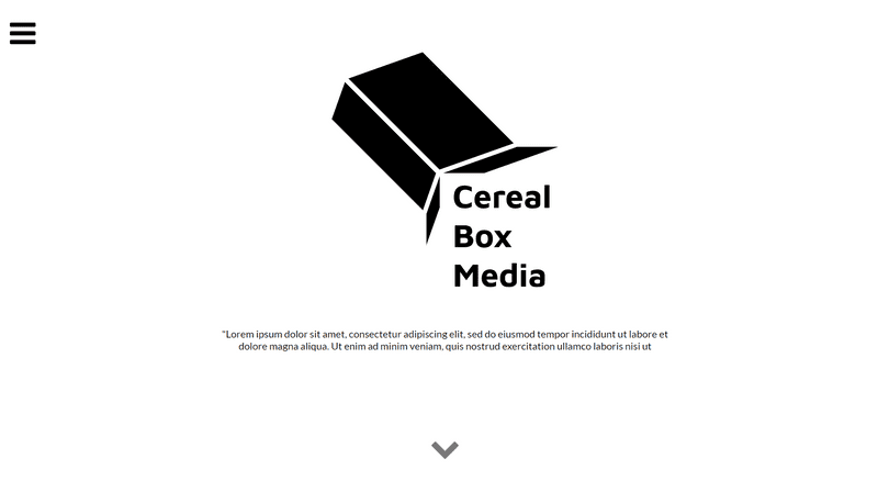
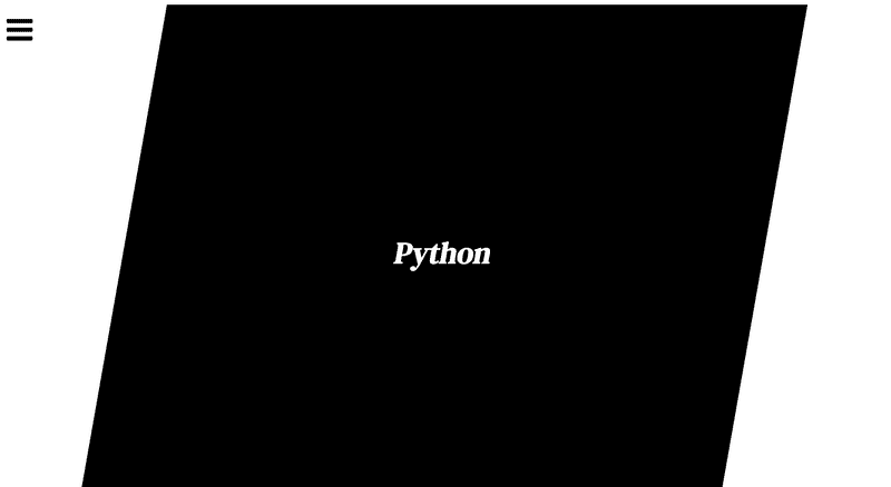
Both the owner of the site and I wanted a clean, minimal look and feel to the website. I expanded on the strong black colour and diagonal lines of the logo to create a visual identity for the website. The shapes used help guide the user’s eye down the page, whilst reinforcing the brand. The down arrow has a flashing animation, letting the user know there is more beneath.
Homepage
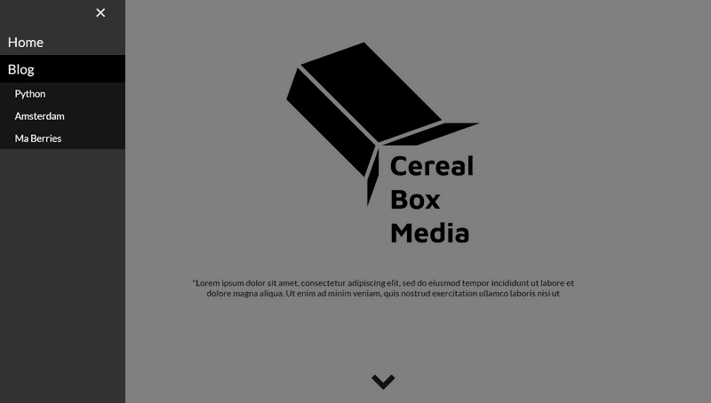
Sidenav bar
For the sidebar, I used dark colours to contrast against the white of the website. The sub-menus are expandable, so as to not present too much information to the user at once.
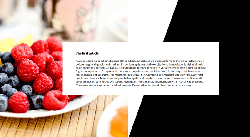
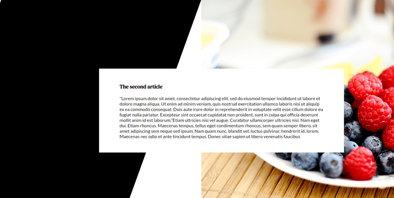
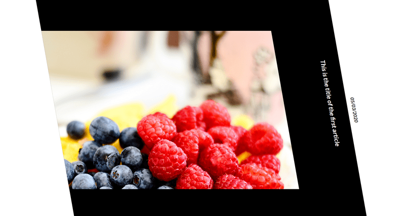
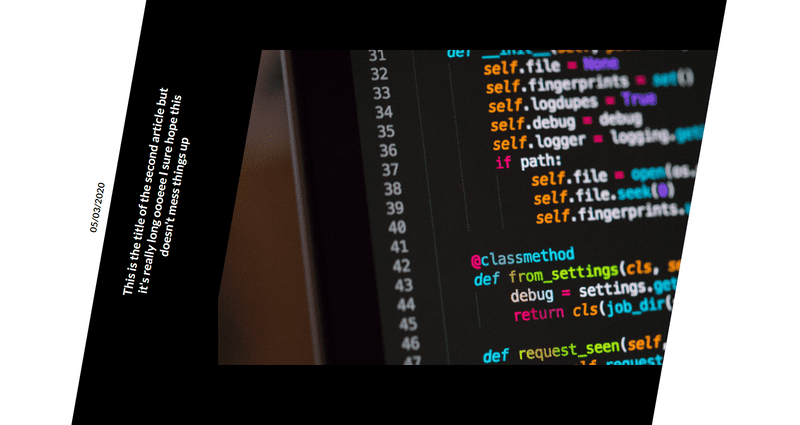
Featured articles
The featured articles section has article text and images on alternate sides to create a sense of balance, and to flow with the diagonal shapes.
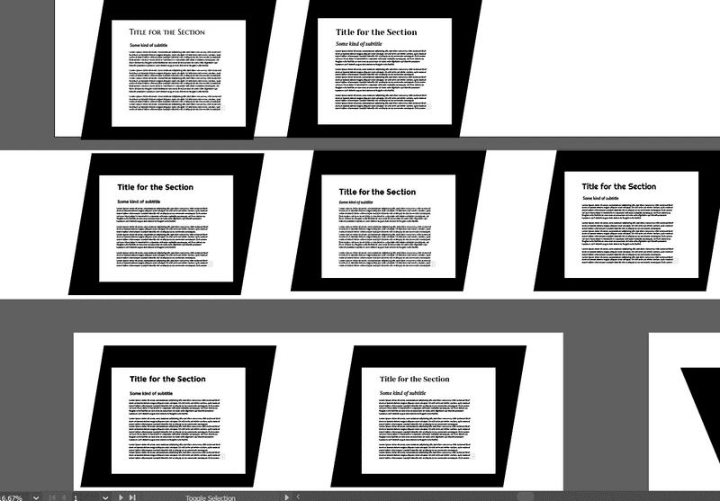
Font experiments
Here I show the experiments I did for font pairings. The font of Lato was selected for its friendly, open style whilst still being highly readable, modern and professional, which correlates to the mission of Cereal Box Media. The heading font of DM Serif text with its high contrast and rounded terminals is both an on-trend style, but also refined enough compared to other similar fonts that it still conveys a sense of professionalism.
Blog index page
Mobile blog index page
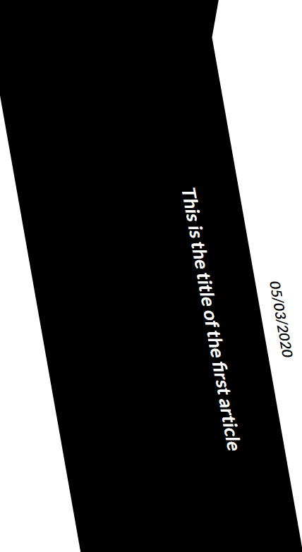
The blog index page uses the diagonal black shapes as a strong visual guide, along which the elements of the page are laid. I aligned the text parallel to the shapes to create visual interest and to add to the flow of the page. Although this slightly reduces the speed at which the titles can be read, the fact that they are short headlines and laid out in an easily legible typeface offsets this.
Mobile blog page
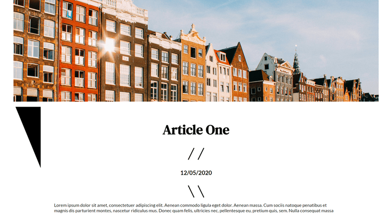
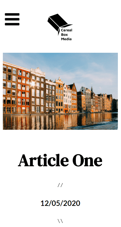
For the blog pages themselves, I still used the diagonal shapes in the background, but let the text of the blog have space to breathe itself. A large, eye-catching header image helps draw the user into the page.
Logo
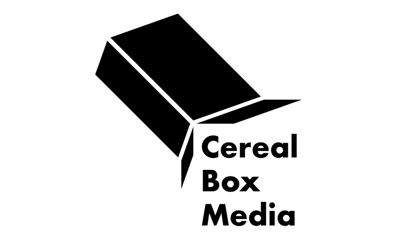
Initially I sketched out a lot of different designs of the logo being a standing-up cereal box with no typography. However, I started playing around with ideas of the cereal box pouring different things out of it, as that was a more dynamic concept. The implied action created by the "pouring" of the text from the cereal box combined with the neat square effect created by the negative space around the text was a way of keeping it both interesting and also professional.
Loading animation
I designed and coded this loading animation as part of a logo system for the Cereal Box Media brand. The colours and output of the cereal box can vary, but it retains the distinctive "pouring cereal box" symbol. This way, it can be applied flexibly.
